Awards & Recognition
Our Awards, Achievements & Memorable Moments
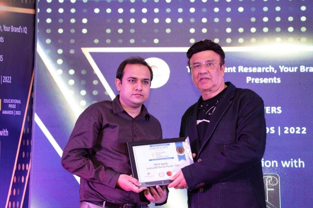
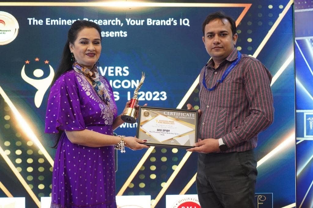
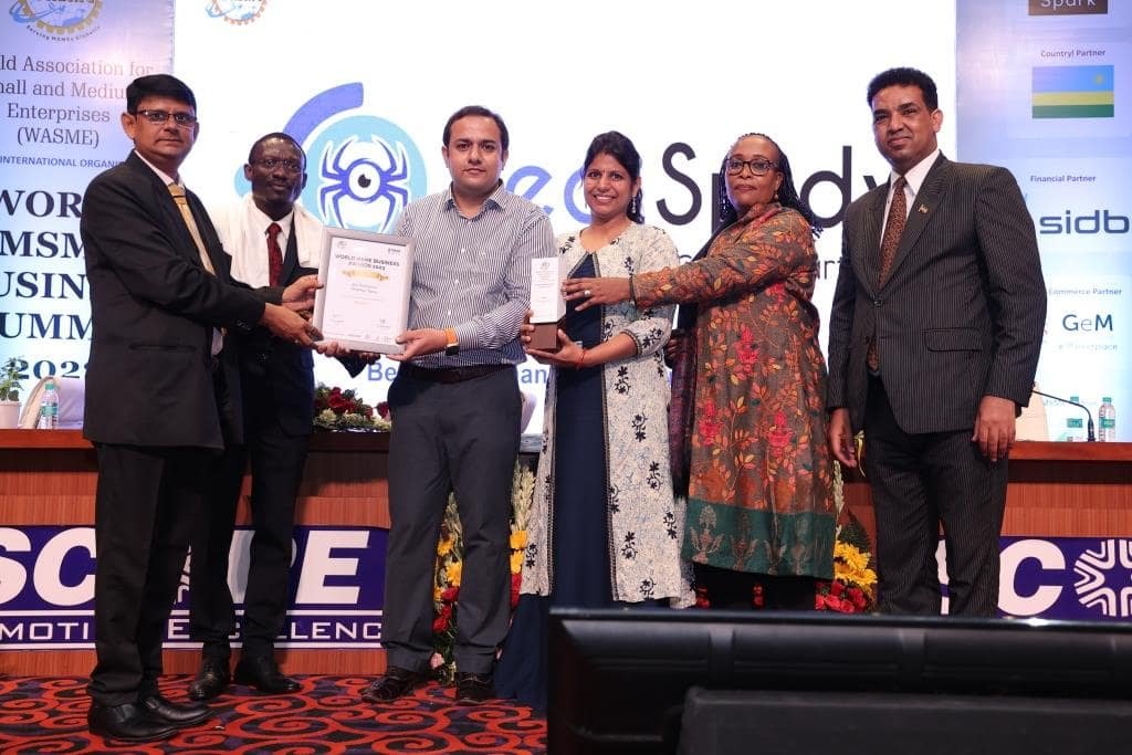
A glimpse of SEOSpidy's journey — industry awards, recognitions and celebrated moments with Bollywood personalities that reflect a decade of trust and excellence.


Over 70% of your website visitors are on smartphones. SEOSpidy builds responsive, mobile-first websites that deliver a seamless experience on any device — boosting your SEO rankings and keeping visitors engaged.
Google's mobile-first indexing means the mobile version of your website is what determines your search rankings. A responsive, fast-loading mobile site is no longer optional — it is the foundation of all digital success.
Responsive web design uses flexible layouts, fluid images, and CSS media queries to create websites that automatically adapt to any screen size. Whether a visitor opens your site on a 4-inch smartphone, a 10-inch tablet or a 27-inch desktop monitor, they get a perfectly proportioned, easy-to-use experience.
Since 2015, SEOSpidy has built responsive websites for Delhi businesses across every industry. Our mobile-first methodology means we design the smartphone experience first — the most constrained and most common screen — and then progressively enhance it for larger screens.
One website, every device — built mobile-first
Google's mobile-first index rewards responsive, fast mobile sites with significantly higher search rankings.
Visitors who can easily read and navigate your site on their phone stay longer and engage more with your content.
Mobile-optimised forms, CTAs and checkout flows directly increase enquiry submissions and online purchases.
Mobile-optimised images and lean code reduce load times, passing Google's Core Web Vitals for better rankings.
One responsive website replaces the need for separate desktop and mobile versions, reducing maintenance costs.
Responsive design adapts to new screen sizes and devices without needing a rebuild — protecting your investment.
A structured process that prioritises mobile experience at every stage.
We analyse your audience's device usage, competitor mobile experiences, and your current site's mobile performance.
We design the mobile layout first — the most constrained and most visited experience — before scaling up.
Clean CSS with fluid grids, flexible images and strategic breakpoints bring the design to life on all screens.
We test on real devices — Android and iOS — plus dozens of simulated screen sizes to catch every layout issue.
Post-launch we monitor Core Web Vitals and mobile usability scores, and fine-tune for optimal performance.
View our complete website design service portfolio
Responsive online stores built to drive sales
Custom responsive WordPress websites
High-converting responsive landing pages
Modernise your existing site with responsive design
Keep your responsive site fast, secure and updated
Responsive web design is an approach where a website's layout and content automatically adapts to the screen size of the device being used — whether a smartphone, tablet, or desktop computer. This ensures every visitor gets an optimal experience regardless of how they access your site.
Google uses mobile-first indexing, meaning it primarily uses the mobile version of your site to determine rankings. A responsive, mobile-friendly website is essential for achieving and maintaining strong Google rankings in 2025.
Yes. Google rewards mobile-friendly, fast-loading websites with better rankings. A responsive website that passes Core Web Vitals checks will have a significant advantage over non-responsive competitors in Google's search results.
In most cases yes — though for very old websites a rebuild is often more cost-effective than retrofitting. We will assess your existing site and recommend the most efficient approach to make it fully responsive.
We test on a wide range of real devices and screen sizes, as well as using browser developer tools to simulate hundreds of device configurations. We check for layout issues, touch target sizes, font readability, image scaling, and form usability across all breakpoints.
Get a free responsive design consultation from SEOSpidy — Delhi NCR's mobile-first website design specialists since 2015.
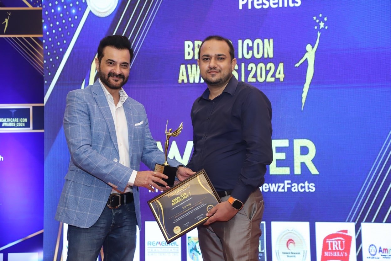
A glimpse of SEOSpidy's journey — industry awards, recognitions and celebrated moments with Bollywood personalities that reflect a decade of trust and excellence.